|
||
|
|||||||||||||||
|
#61
|
||||
|
||||
|
|
#62
|
|||
|
|||
|
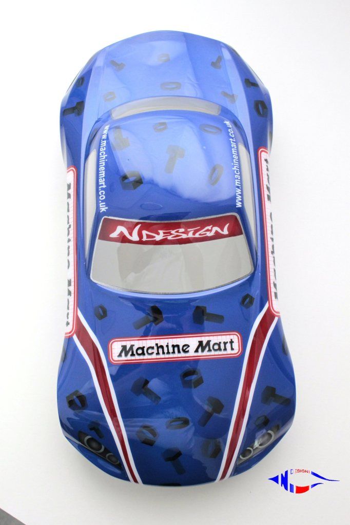
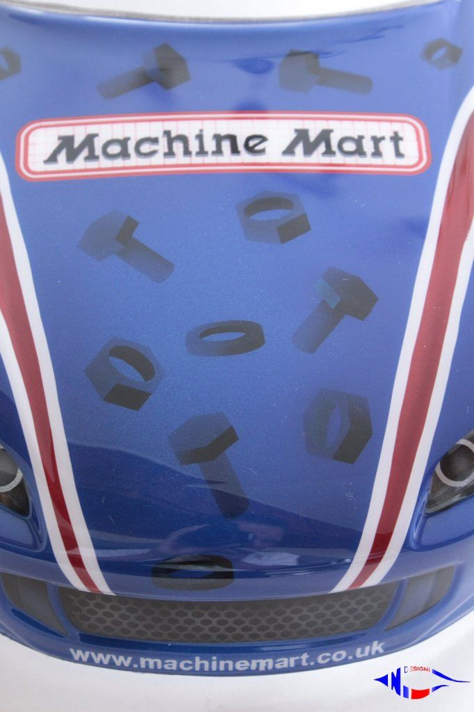
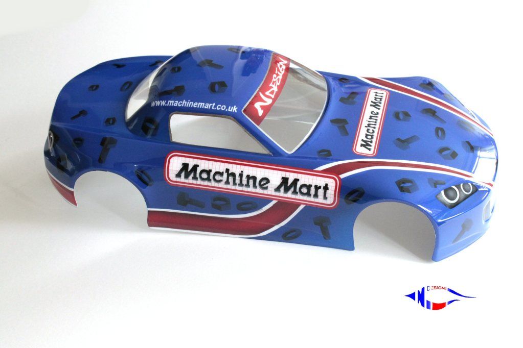
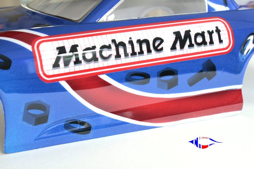
FanTastic - is it all paint ?
|
|
#63
|
||||
|
||||
|
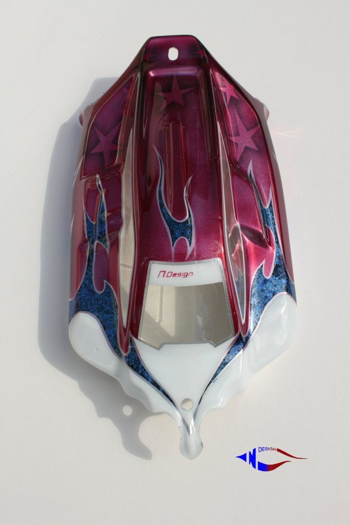
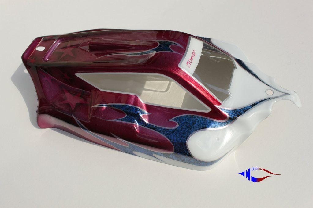
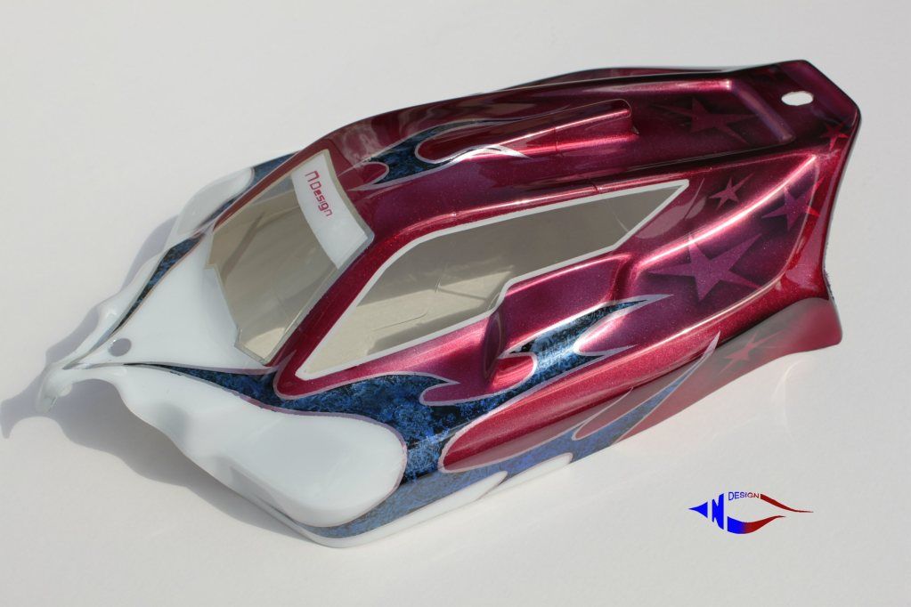
Cheers Andy, yes it's all paint took a while to do though.
|
|
#64
|
||||
|
||||
|
Come on Neil your slacking, no threads on the nuts or bolts....
 Looks fantastic mate, those thin lines on the actual logo are mental, great work as always ! |
|
#65
|
|||
|
|||
|
thats ridiculously good

|
|
#66
|
||||
|
||||
|
Cheers guys. Your quite right Ian I'm getting very lazy in my old age, by the way thin red lines are done with a marker pen! see told you i'm lazy.

|
|
#67
|
||||
|
||||
|
|
#68
|
||||
|
||||
|
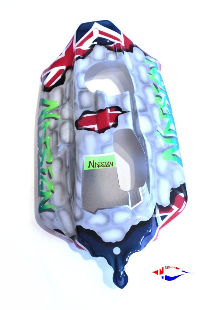
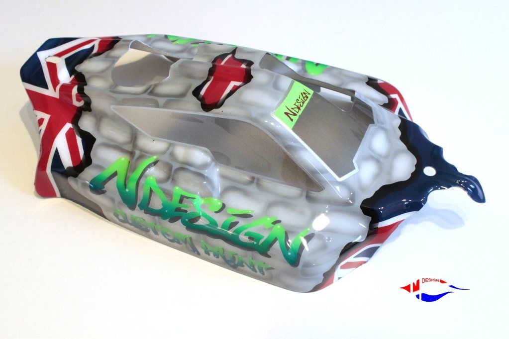
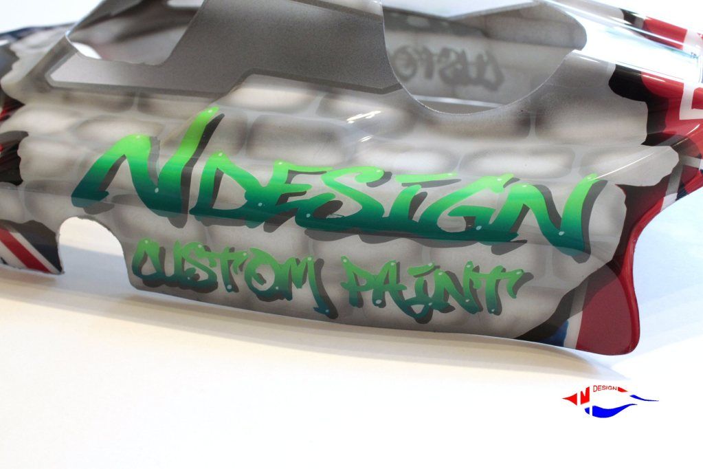
A shell for me !
|
|
#69
|
||||
|
||||
|
|
#70
|
||||
|
||||
|
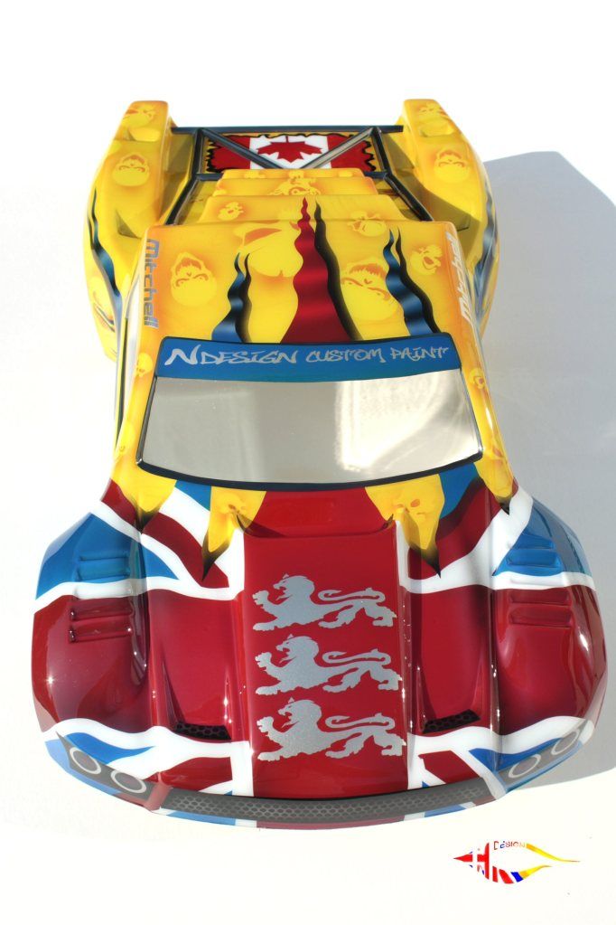
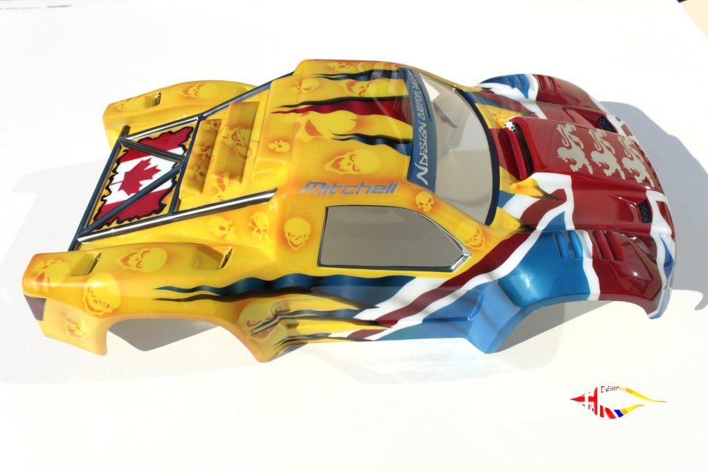
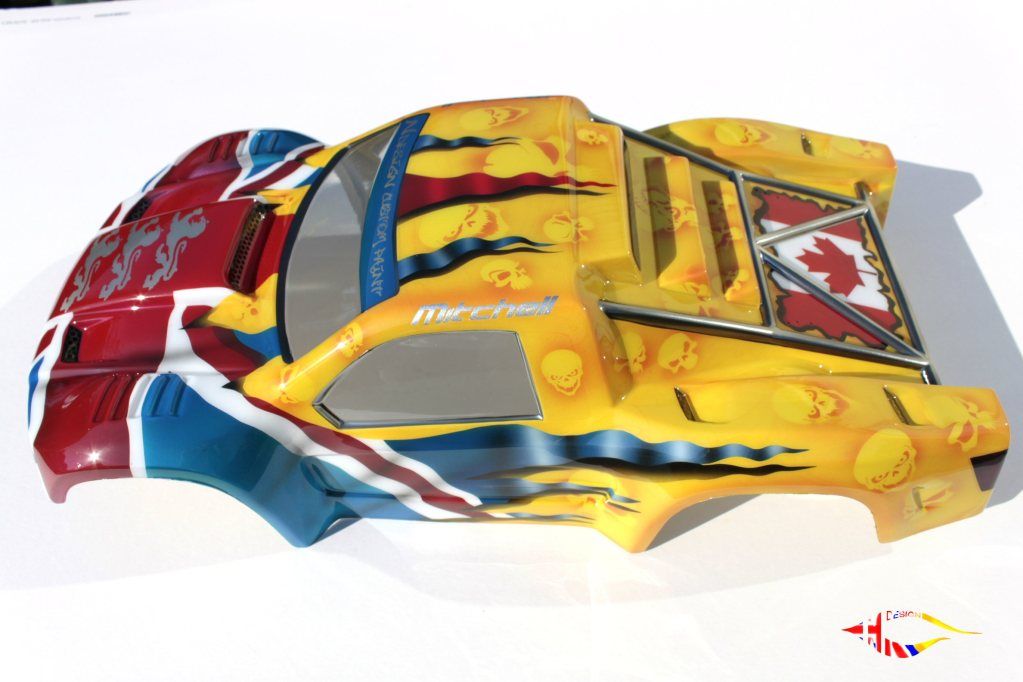
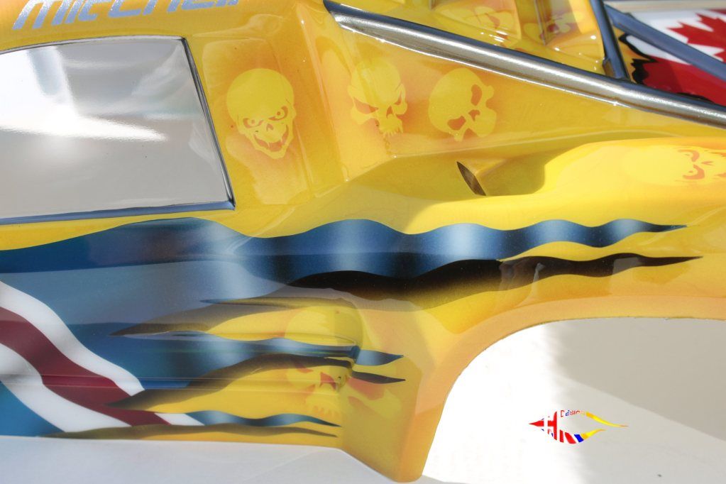
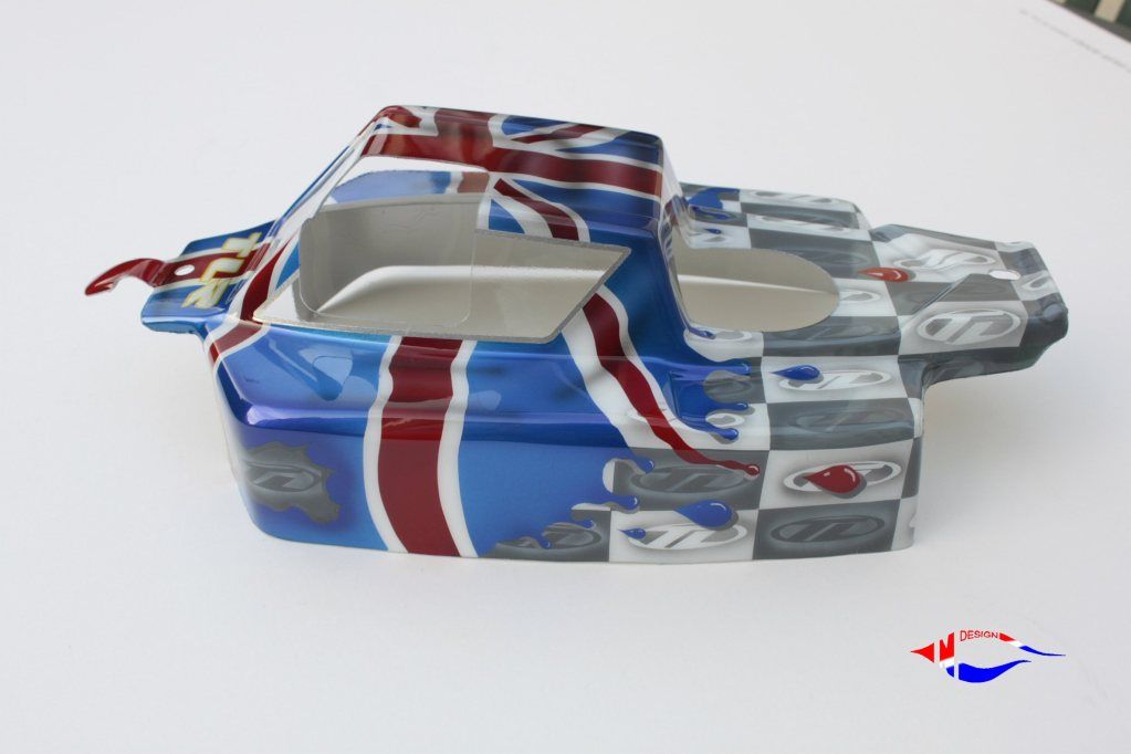
Looks cool Neil, good flag with the tails and shadows, it shows up real well against the main colour, nice work !
|
|
#71
|
|||
|
|||
|
Shortcourse looks great - nice colour choices, it works really well as a whole.
I like the detail in there too - flag looks very convincing. |
|
#72
|
||||
|
||||
|
Cheers guys, I like this one too, not often I can say that

|
|
#73
|
||||
|
||||
|
nice job buddy

|
|
#74
|
||||
|
||||
|
|
#75
|
||||
|
||||
|
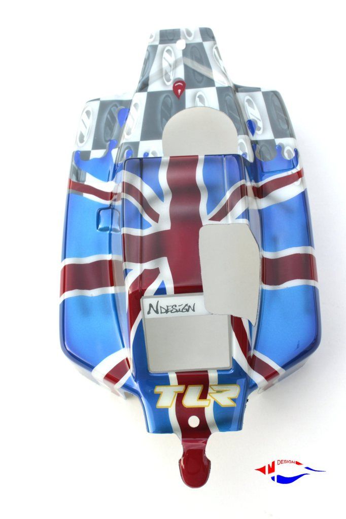
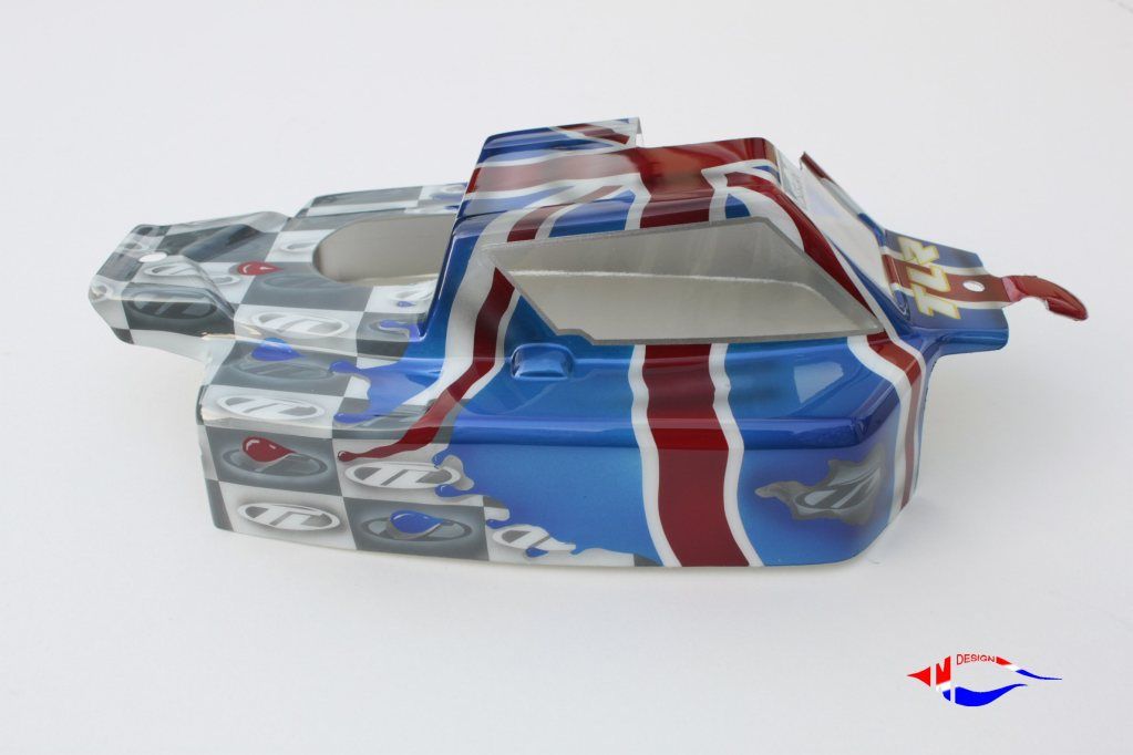
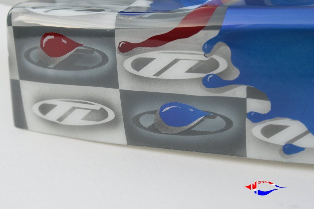
checks are sharp looking matey

|
|
#76
|
||||
|
||||
|
Cheers Jon
|
|
#77
|
||||
|
||||
|
Lovin' the repeating logo pattern, very very cool !
|
|
#78
|
||||
|
||||
|
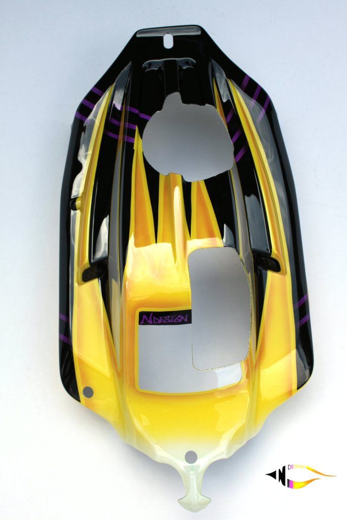
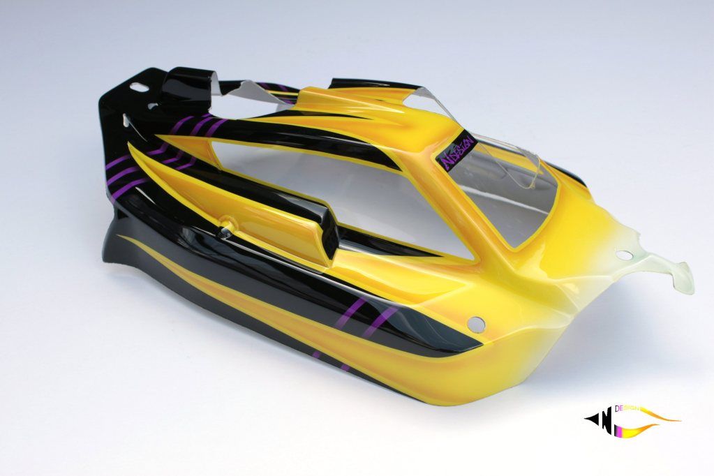
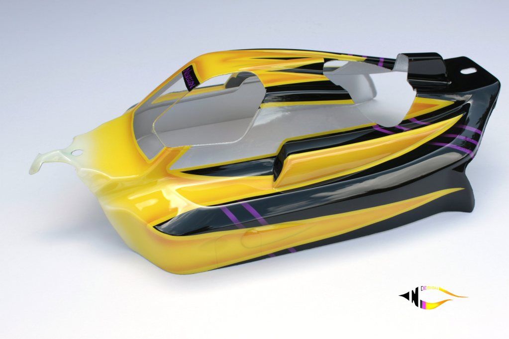
Copy of the Losi box art shell so can't take credit for colours or design
|
|
#79
|
||||
|
||||
|
|
#80
|
||||
|
||||
|
 |
| Thread Tools | |
| Display Modes | |
|
|