|
||

|
|
||||||||||||||||||
|
#201
 18-10-2011
|
||||
|
||||
|
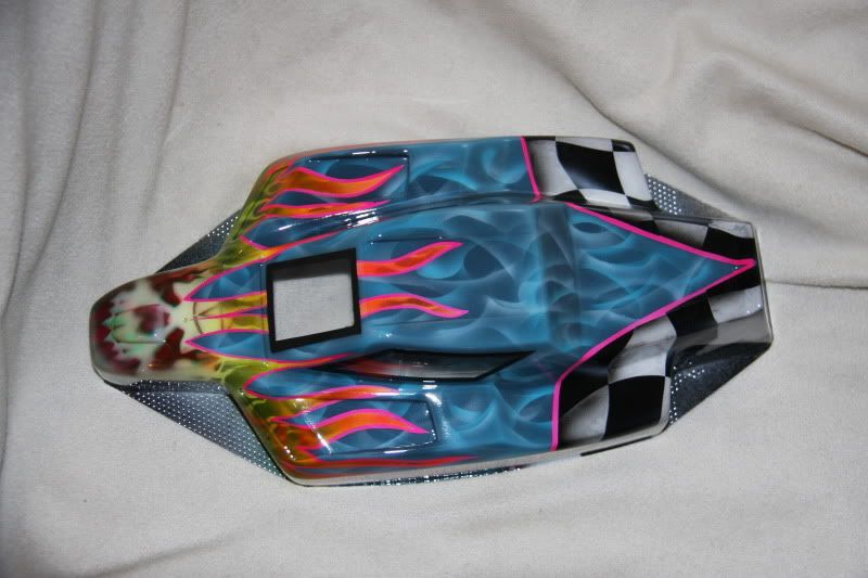
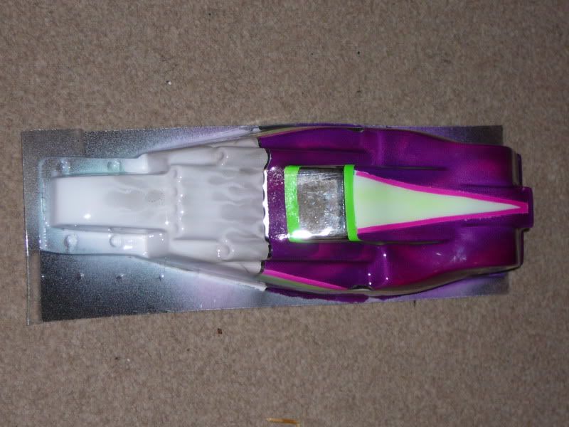
Thanks Ian. It does look better in the flesh brighter and much more depth than the photo shows.

__________________
Trader Feedback Here. 
|
|
#202
14-11-2011
|
||||
|
||||
|
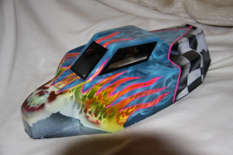
One from tonight. Got a little carried away. What do you think.
__________________
Trader Feedback Here.
|
|
#204
14-11-2011
|
||||
|
||||
|
No not yet just playing with shells I have
__________________
Trader Feedback Here.
|
|
#205
14-11-2011
|
||||
|
||||
|
Very cool, i like it a lot
__________________
 A rc car is not just for christmas, it's for life
|
|
#206
15-11-2011
|
||||
|
||||
|
Thank you Bud. It looks better in the fleas

__________________
Trader Feedback Here.
|
|
#207
15-11-2011
|
||||
|
||||
|
Looks better in the fleas
 That's mental mate, so much work, good going. Where have you been ? Nothing posted for 3 weeks... That's unlike you.
|
|
#208
15-11-2011
|
||||
|
||||
|
Thanks Ian. Been busy at home and building real cars at work
Will try and get a few more done. Re arranged my paint room at the weekend so should be easier
__________________
Trader Feedback Here.
|
|
#209
15-11-2011
|
||||
|
||||
|
Quote:
|
|
#210
02-12-2011
|
||||
|
||||
|
One for Master Watts
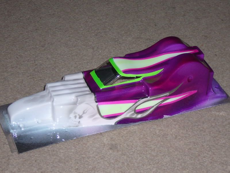   A brace for Mr Craig Hilton. 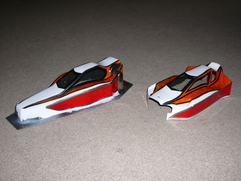 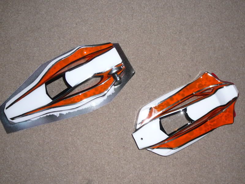 Hope you like them guys.
__________________
Trader Feedback Here.
|
|
#211
02-12-2011
|
||||
|
||||
|
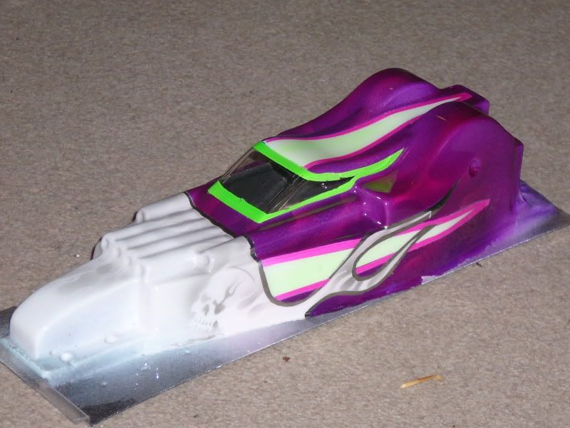
Loving your colour combo's Chef.
Those flames in the purple are cool too !
|
|
#212
02-12-2011
|
||||
|
||||
|
Thank you sir.
__________________
Trader Feedback Here.
|
|
#213
02-12-2011
|
||||
|
||||
|
agreed
|
|
#214
02-12-2011
|
||||
|
||||
|
Thank you Jon but I'm Still chasing those perfectly sharp crisp lines.
__________________
Trader Feedback Here.
|
|
#215
02-12-2011
|
||||
|
||||
|
You look like you're doing okay to me.
Maybe you should do a more simple design, 3 colours with a different colour pinstripe to pick out the shapes, no fancy effects just colours, maybe a fade or 2, no stencils ? It might make things look cleaner ? Concentrate on the shape of the design rather than the effects within it. See if that changes things ? I like your designs because you have so much going on but at the same time I think if things are quite busy they're not as clear. It might not work at all, just a theory though, you won't know unless you try.
|
|
#216
02-12-2011
|
||||
|
||||
|
aye, have a go at simplifying things. try laying your paint thinner and making sure it is properly heat set in order to crisp up some of the lines
|
|
#217
30-12-2011
|
||||
|
||||
|
One from tonight, had an issue with the dark area ment to be dots as requested and seemed to attract paint via static so had to get a little creative to cover it up
 I quite like it though looks super clean up front and like a scared fighter at the rear. I quite like it though looks super clean up front and like a scared fighter at the rear. 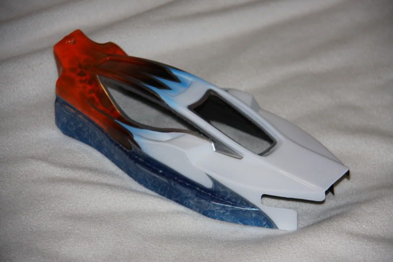 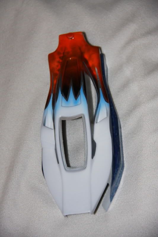 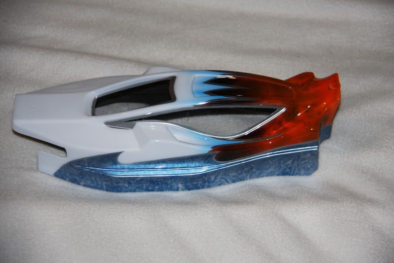
__________________
Trader Feedback Here.
|
|
#218
30-12-2011
|
|||
|
|||
|
That looks a lot cleaner, I like the effects you have done and they work well with the design.
I like the way it doesn't look like you've used a stencil on the red and it blends well into the body. Nice touches and Good work you should very pleased with that.
|
|
#220
30-12-2011
|
||||
|
||||
|
YOUR BEST ONE YET Chef !!!
Really impressed, you've nailed this perfectly. Good balance of colours, well executed, looks fantastic ! Your stuff is quite busy normally but this is much crisper and cleaner looking, it works better because of that. Come on then, where's your 8th shell...
|
 |
| Thread Tools | |
| Display Modes | |
|
|


 Linear Mode

