|
||

|
|
||||||||||||||||||
|
#1
 12-05-2012
|
||||
|
||||
|
Here's some useful info for all you newbie painters out there... give it a try you might be surprised!
Some Formulas for Color Harmony There are many theories for harmony. The following illustrations and descriptions present some basic formulas. 1. A color scheme based on analogous colors  Analogous colors are any three colors which are side by side on a 12 part color wheel, such as yellow-green, yellow, and yellow-orange. Usually one of the three colors predominates. 2. A color scheme based on complementary colors 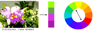 Complementary colors are any two colors which are directly opposite each other, such as red and green and red-purple and yellow-green. In the illustration above, there are several variations of yellow-green in the leaves and several variations of red-purple in the orchid. These opposing colors create maximum contrast and maximum stability. 3. A color scheme based on nature 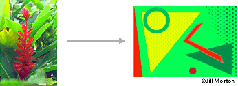 Nature provides a perfect departure point for color harmony. In the illustration above, red yellow and green create a harmonious design, regardless of whether this combination fits into a technical formula for color harmony. Color ContextWhen you've finished exploring "Basic Color Theory," see "The Meanings of Colors" at Color Matters! How color behaves in relation to other colors and shapes is a complex area of color theory. Compare the contrast effects of different color backgrounds for the same red square. Red appears more brilliant against a black background and somewhat duller against the white background. In contrast with orange, the red appears lifeless; in contrast with blue-green, it exhibits brilliance. Notice that the red square appears larger on black than on other background colors. Different readings of the same color If your computer has sufficient color stability and gamma correction (link to Is Your Computer Color Blind?) you will see that the small purple rectangle on the left appears to have a red-purple tinge when compared to the small purple rectangle on the right. They are both the same color as seen in the illustration below. This demonstrates how three colors can be perceived as four colors.  Observing the effects colors have on each other is the starting point for understanding the relativity of color. The relationship of values, saturations and the warmth or coolness of respective hues can cause noticeable differences in our perception of color.
__________________
Joo's Paint Kingmax Servos Optipower Yokomo 
|
|
#2
12-05-2012
|
||||
|
||||
|
Nice post JB and very handy for first time painters to to look through.
Thanks for taking the time to post it. (unless it was just copied from somewhere  even if so.. even if so.. ) )
|
 |
| Thread Tools | |
| Display Modes | |
|
|


 Linear Mode

